Sample Quantiles
Empirical Density Function
Suppose \(y_1, y_2, \ldots, y_n\) is a data sample from a true CDF \(F\).
- The empirical density function (EDF), \(F_n(y)\), is the proportion of the sample that is less than or equal to \(y\):
where
EDF Example
The figure below compares the EDF of a sample of 150 observations drawn from a \(N(0,1)\) with the true CDF.
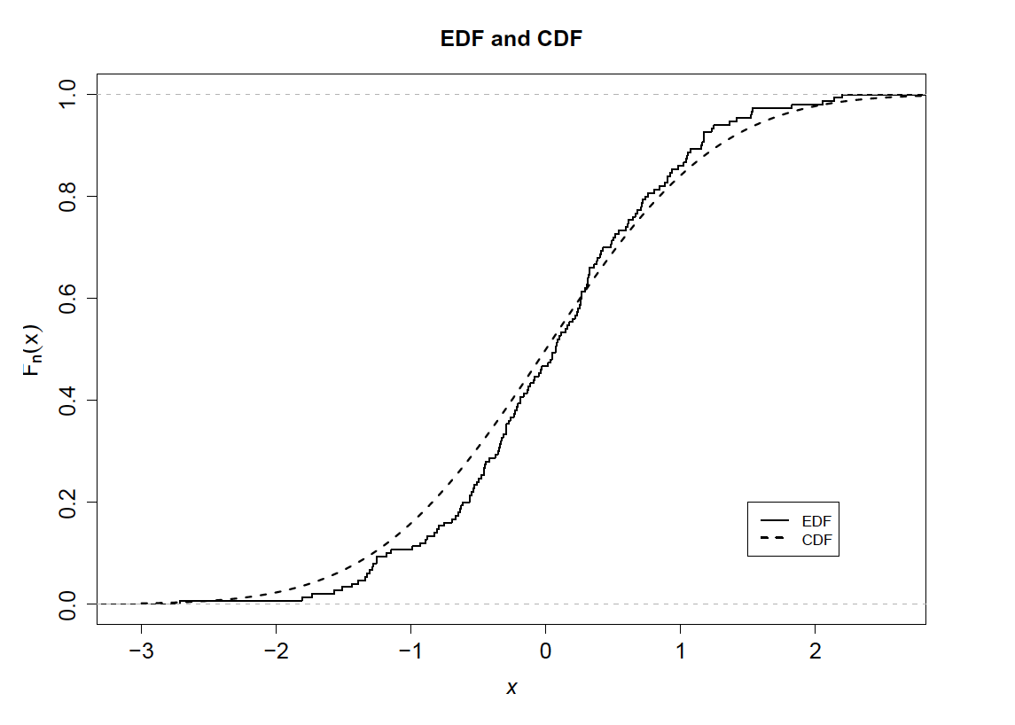
This plot was taken directly from Ruppert (2011).
Order Statistics
Order statistics are the values \(y_1, y_2, \ldots, y_n\) ordered from smallest to largest.
- Order statistics are denoted by \(y_{(1)}, y_{(2)}, \ldots y_{(n)}\).
- The parentheses in the subscripts differentiate them from the unordered sample.
Quantiles
The \(q\) quantile of a distribution is the value \(y\) such that
- Note that \(q \in (0,1)\).
- Quantiles are often called \(100q\) th percentiles.
Quantiles
Special quantiles:
- Median: \(q = 0.5\).
- Quartiles: \(q = \{0.25, 0.5, 0.75\}\).
- Quintiles: \(q = \{0.2, 0.4, 0.6, 0.8\}\).
- Deciles: \(q = \{0.1, 0.2, \ldots, 0.8, 0.9\}\).
Sample Quantiles
The \(q\) sample quantile of a distribution is the value \(y_{(k)}\) such that
- This is simply the value \(y_{(k)}\) where \(k\) is \(qn\) rounded down to the nearest integer.
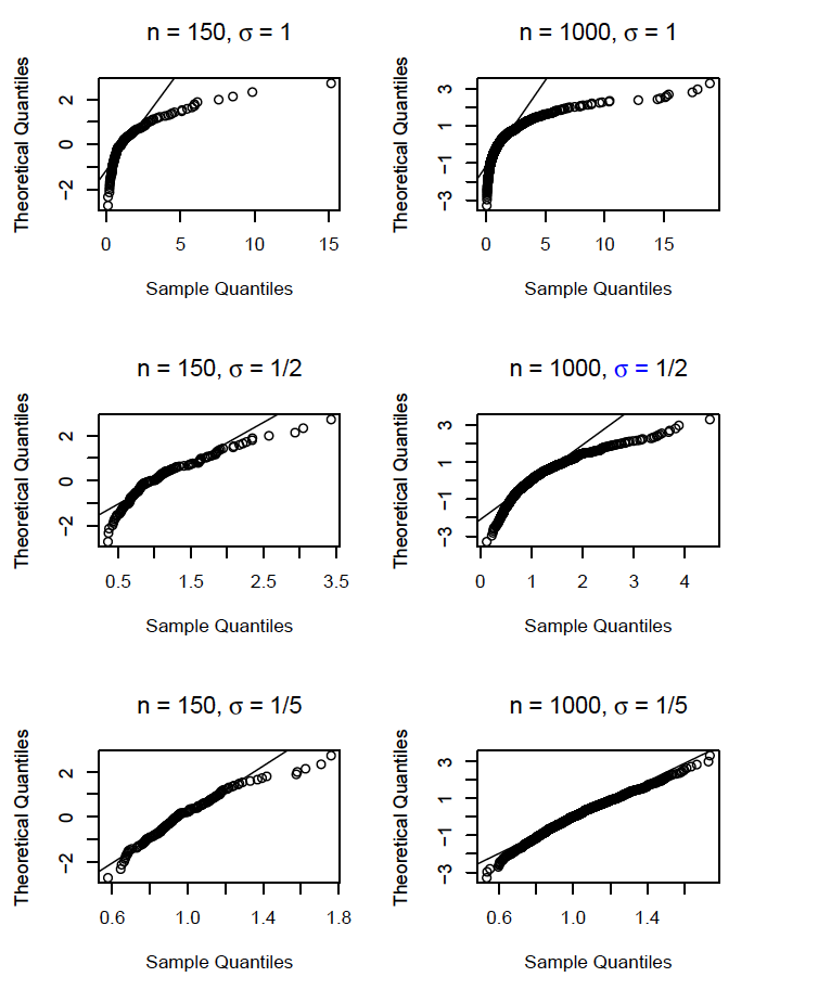
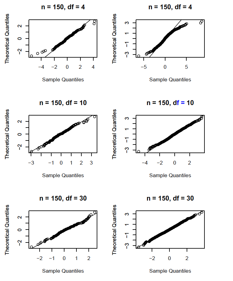
Normal Probability Plots
We are often interested in determining whether our data are drawn from a normal distribution.
If the data is normally distributed, then the \(q\) sample quantiles will be approximately equal to \(\mu + \sigma \Phi^{-1}(q)\).
- \(\mu\) and \(\sigma\) are the true (unobserved) mean and
standard deviation of the data.
- \(\Phi\) is the standard normal CDF.
Normal Probability Plots
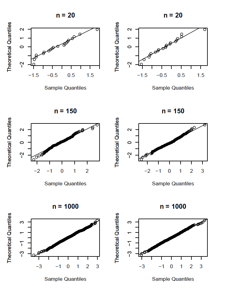
Hence, a plot of the sample quantiles vs. \(\Phi^{-1}\) should be roughly linear.
- In practice this is accomplished by plotting \(y_{(i)}\) vs. \(\Phi(i/(n+1))\), for \(i=1,\ldots, n\).
- Deviations from linearity suggest nonnormality.
Normal Probability Plots
There is no consensus as to which axis should represent the sample quantiles in a normal probability plot.
- Interpretation of the plot will depend on the choice of axes for sample and theoretical quantiles.
- We will always place sample quantiles on the \(x\) axis.
- In R, the argument ‘datax’ of the function ‘qqnorm’ must be set to ‘TRUE’ (by default, it is ‘FALSE’).
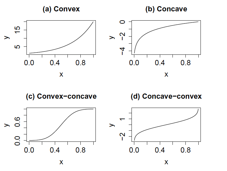
Interpreting Normal Probability Plots
With the sample quantiles on the \(x\) axis:
- A convex curve indicates left skewness.
- A concave curve indicates right skewness.
- A convex-concave curve indicates heavy tails.
- A concave-convex curve indicates light tails.
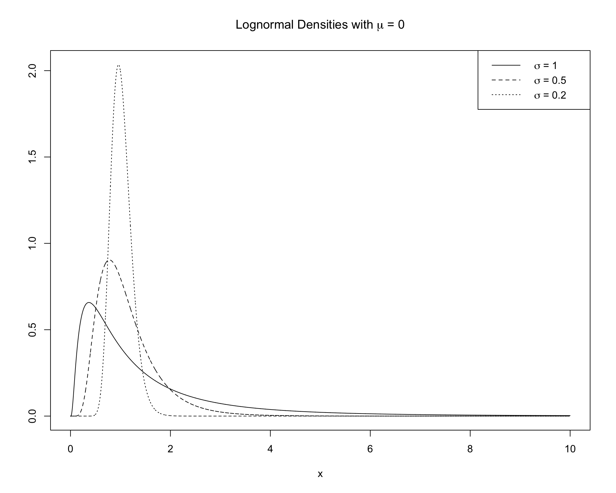
Plots of Lognormal Densities
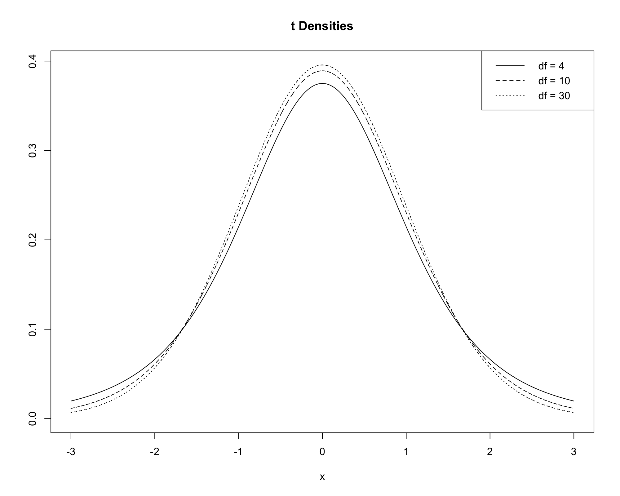
Plots of \(t\) Densities
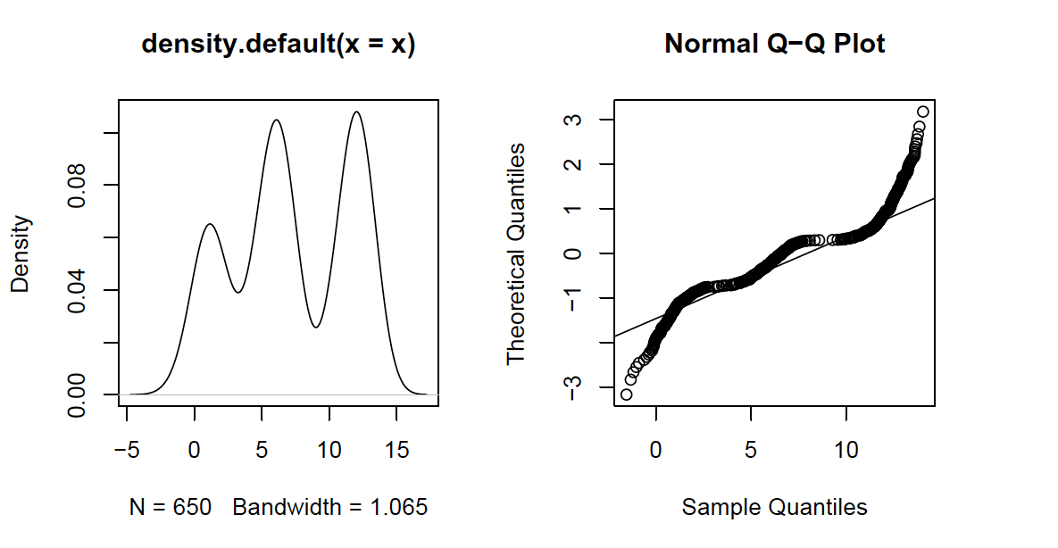
Normal Probability Plots vs. KDEs
If the relationship between theoretical and sample quantiles is complex, the KDE is a better tool to understand deviations from normality.
This plot was taken directly from Ruppert (2011).
QQ Plots
Normal probability plots are special examples of quantile-quantile (QQ) plots.
- A QQ plot is a plot of quantiles from one sample or distribution against the quantiles of another sample or distribution.
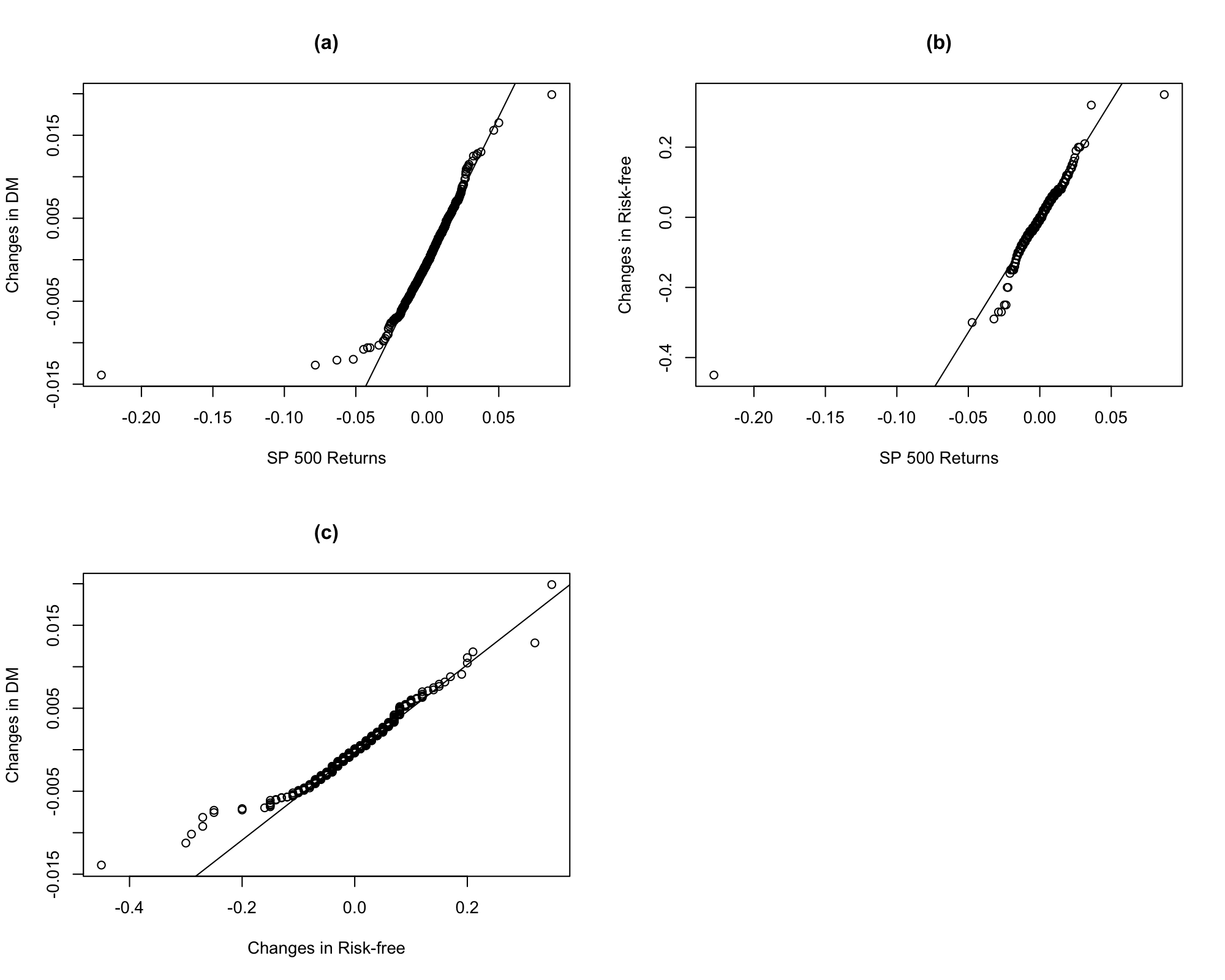
- For example, we could compare the quantiles of S&P 500 daily returns against a \(t\) distribution.
- Alternatively, we could compare the quantiles of S&P 500 daily returns against other financial data.
- QQ plots of multiple datasets indicate which distribution is more/less left/right skewed or which has heavier/lighter tails.